Monday, January 7, 2013
Making Book: How My New Corman Cover Came to Be
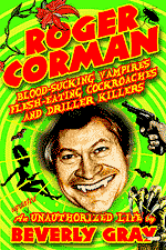
It is a truth universally acknowledged that you can judge a book by its cover. In fact, that’s exactly what many people do. That’s why the publishing industry spends the big bucks designing cover images carefully calculated to entice readers. When my Roger Corman: An Unauthorized Biography of the Godfather of Indie Filmmaking first appeared in hardcover, the dust jacket was a nice shade of purple, but the rather stiff photo of Roger seated behind an enormous (and slightly phallic) movie camera wasn’t much of a come-on. Several years later, a hipper publishing house changed the title of the paperback to Roger Corman: Blood-Sucking Vampires, Flesh-Eating Cockroaches, and Driller Killers, and came up with a cover design that was memorably lurid. I still get a chuckle out of it. Look below to see what I mean:
For my new eBook, it’s fallen to me to choose my own cover image. I told the talented J.T. Lindroos I was looking for something garish, and reflecting a B-movie sensibility. I wanted to include Roger’s face, as in the paperback cover, and I also suggested that a hint of the man-eating plant from Little Shop of Horrors would be welcome. J.T., a Corman aficionado as well as a fan of my book, almost immediately cranked out this design:
It was a good start, but the photo didn’t much work in this context, and Audrey Junior was unrecognizable. Back to the drawing board:
Yes! This version, with its caricature of Roger’s face, was much more vivid. But the dominatrix at right didn’t look like much of anything, and the guns pointed at Roger’s temples made me squeamish. Also, I had a small brainstorm: what about giving my former boss fangs?
Roger as vampire seemed to strike exactly the right note. And I loved the new cockroach in the upper corner. But the retro gal with the gun had an odd WWII vibe, and what was up with those paintbrushes (?) on the lower right? They were supposed to be monster claws, but this was hardly obvious. My suggestion: for a sexy babe, what about one of those vixens who grace the mudflaps of big trucks? And how about an outstretched claw menacing the onlooker? It could mirror the claw on one of my all-time favorite Concorde posters, for The Terror Within.
J.T. listened to his subconscious, which dreamed up a cross between my mudflap maiden and the Bride of Frankenstein, with a lightning bolt running through her Marge Simpson beehive. He dubbed her “Bride of Mudflap,” and for me it was love at first sight. A few more tweaks, and we were done.
Does this have anything to do with the thinking that goes into movie posters? I’m glad you asked. When I was a Corman minion, we didn’t spend much on poster art. But we did put great ingenuity into “selling” our product line through vivid pictorial images that conveyed the spirit of each film. On more than one occasion, the poster was circulated before the screenplay was even written. Take, for instance, the flamboyant image (by the great John Solie) of David Carradine posing in futuristic biker regalia to advertise Bloodsport. This poster was sent to the Cannes Film Festival, along with Carradine himself, to drum up enthusiasm for a kind of sequel to Death Race 2000. The film itself never lived up to the poster’s promise. But hey! That’s show biz!
Subscribe to:
Post Comments (Atom)


I love the new cover - and it's really very cool to get to see the step-by-step process you went through to arrive at it!
ReplyDeleteI've always enjoyed movie posters - my two regular weekly departments at my blog feature them, as a matter of fact. It's amazing to me that American International used to design the poster even before the script was written - and then that conceit was appropriated by Mr. Corman for New World Pictures!
Top marks for this post!
(p.s. I'm reading about the differences between Roger and Gene as pertains to money - I'm enjoying the book more this time - the first time I read it was on lunch breaks while managing a bookstore about ten years ago. Now I'm able to take my time a little more. Good stuff!)
I'm always happy to get top marks, Mr. Craig. As you note, Roger and his brother Gene are worlds apart in many ways. Gene is certainly not without ability in his own right, and has an Emmy to prove it, but he's quite different in regard to money, lifestyle, and general flamboyance. And -- of course -- he doesn't have Roger's status as a living legend.
ReplyDelete